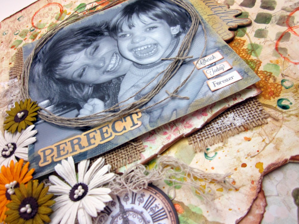
This layout was really fun to create and I used lots of different "tools" to add color and texture to the base page using the wonderful Art Anthology products.
The first thing to do when you are creating a mixed media style layout, is to determine the area where your photo will be and lightly draw a box around the area with a pencil. You don't want to have your very favorite designs covered over completely! So planning helps immensely.
Next, I will generally add some stenciling with the Art Anthology Colorations. I want this first layer of design to be flat, so I can keep building it up. I used the diamond stencil with Grass and Plush. Remember to let each step dry before moving on to the next.
I used a doily stencil, and the Coral Sorbet Dimensional paint for the next layer and positioned this behind the upper right corner of my photo. This paint is great for holding it's shape and it's kind of shimmery and semi-transparent - so it is great to reflect the light. I also added some stamped images around the edges of the photo. And around the actual photograph, I dry brushed Art Anthology Gesso on, to help distress that as well.
It's pretty obvious how to make splatters with the Colorations - just unscrew the sprayer from the bottle and flick the tube towards the paper. I used that technique, (with Salted Caramel) and in some places, I used a drinking straw and blew air on the wet ink to move it around.
I also wanted some larger open circles, so a added paint around the edge of my paint lid (using the Sorbet - Coral) and used this like a stamp. Just make sure to wipe off the excess when you are finished so you don't have a hard time opening your paint.
I also dipped the drinking straw into paint and "stamped" with that ( Sorbet - Mint Julep).
I put a layer of stenciled molding paste over some of the designs - and after that was dry, I added more drips.
I also like adding hand stitching to my layouts. I use a heavy twine, so I always pierce the holes first and then it's much easier to get clean results.
I used the same twine to create a "frame" around my photo. Bits of burlap were stuck under the photo as a mat, and I rubbed a bit of gesso on those areas.

Mixed Media layouts aren't hard! They really are fun. Don't be afraid to experiment with your paints and mediums and enjoy the journey!


5 comments:
Great mixed media page! Love these papers and your design! Thanks for submitting to Creative Embellishments!
Gorgeous LO!! Love all of your yummy techniques!! Thank you for playing along with Creative Embellishments!!
This is so beautiful! Thank you for playing along with Creative Embellishments!
Awww super sweet pic and beautiful layout!! Love the background misting/masking and twine! Thanks or playing along at Creative Embellishments.
Congrats on your win! Beautiful page!
Post a Comment